SURA
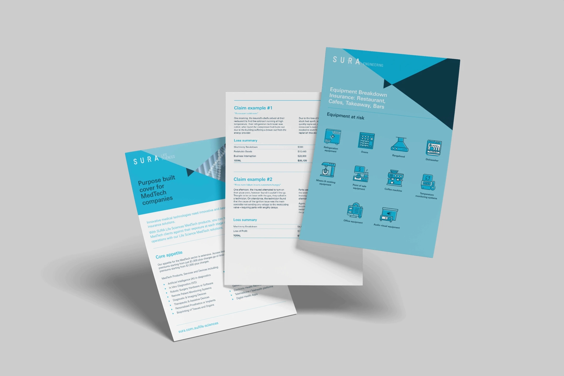
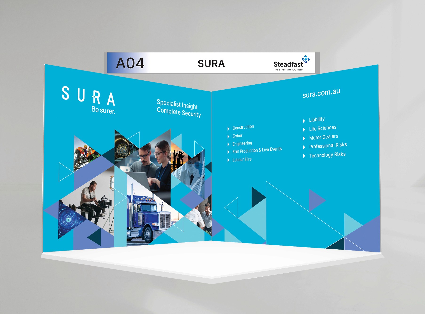
SURA's visual and print redesign unifies specialist insurance products through triangle motifs symbolizing security and risk protection. Competitor research inspired clean, bold typography and minimalism to strengthen brand identity. Delivered hero sections, product grids, and print assets like brochures, enhancing focus amid diverse offerings.
Industry:
Year:
Agency:
Role:
Tools:
Challenges
Current SURA branding lacks visual strength amid multiple products and images, diluting focus on specialist insurance niches.
My Approach
Results